
Five Rules for Playing with Fabric Patterns
Whether in fashion or interior design, when designers freely play with fabrics, patterns, and textures, it can produce a visual and sometimes even sensory masterpiece! And, if you’ve been thinking of spicing up your interior design style by mixing fabric patterns yourself, we’ve got some good news. You can mimic those talented designers’ years of experience by following 5 foolproof rules for fabric pattern play that will have your space looking professionally-designed in no time!
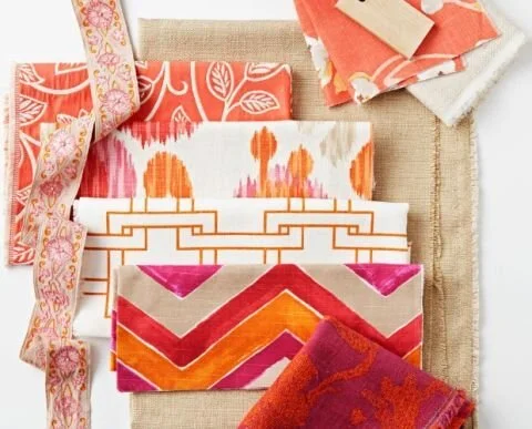
1.) Choose 2 Colors + 1 Neutral
Experienced interior designers will sometimes use four or five different colors in their design concept, but start your pattern mixing on comfortable, stable footing by sticking with three colors total—two colors and a neutral. First, decide on your two colors, taking guidance from the biggest pieces in your space, such as sofas and rugs. Then, choose a neutral with the knowledge that neutrals come in, not only whites and ivories, but also grays and blacks. Consult the color wheel if you’re stuck or need confirmation that two colors look pleasing next to each other but sticking to the two colors and a neutral rule is an easy and sure-fire way to create the perfect beginner palette!
2.) Vary Pattern Scale
Multiple large-scale prints can distract the onlooker as they compete for focus, so be sure to use a mix of both small and intricate patterns and large-scale patterns. Another important tip within this category is that the location of your pattern should vary according to its scale. Make sure that you place large scale patterns on large canvases, such as whole accent walls or long drapery, and small patterns on small canvases, aka accent items, like chairs and pillows.
3.) Pair Patterns With Solids To Create Boundaries
Healthy boundaries aren’t just important in regards to relationships—patterns need their own defined spaces in order to work their magic! Create clear visual boundaries between patterns and give each its own crisp, clean distinction by regularly infusing solids into your design. For example, if you upholstered a beloved chair in a beautiful but busy paisley print, you’ll probably want to choose a solid color for the rug on which it sits.
4.) Choose, At Least, One Pattern That Has ALL Colors in Your Palette, aka Your 2 Colors + 1 Neutral
This is truly the most important fabric pattern choice here. This one fabric, which should incorporate all three of your color choices, is what creates cohesion and makes all of the other patterns work together in harmony. Use it as often as you can along with your other chosen patterns!

5.) Pick, At Least, Three Different Patterns
Now’s the time to finally pick your patterns, incorporating everything you know from the three tips above. Stick with the colors you chose in step one, and remember that you want to vary your scale. To get you started, some of our favorite fabric trends at the moment are kaleidoscope, botanicals, and retro-futurism. This is the time to let your intuition guide you! You know the basics, so don’t stress - have fun with your pattern play!
Whatever you do when designing your space using fabric patterns, don’t be afraid to break a rule! If your heart is really set on three large-scale patterns, then give them a try. The worst-case scenario is that you’ll have to go replace one with a smaller-scale pattern or a solid color. If you need some inspiration or would like to go over your plan with a local expert in fabric design, reach out to the team at Carmen’s Custom Window Treatments in Cleveland Heights, Ohio. Our team of design experts would be honored to help you pair the right fabric patterns and colors to create the perfect aesthetic for your space!